
Autodesk (Case Study)
As part of Autodesk's Data at the Center initiative, we decided to expand the clash detection feature of a construction file management system called BIM 360 Docs. Our goal was to put exploratory wireframes in front of customers and use their insights to make meaningful iterations. I was selected to present our findings to Autodesk’s co-CEO, Amar Hanspal.
BIM 360: Clash Detection
Company: Autodesk
Role: UX Designer
Date: August 2016
During my internship at Autodesk, there was a company-wide initiative to move towards creating software that predicted user needs by not only detecting issues, but offering solutions and ultimately resolving the issues as well. I worked with BIM 360 Docs, a cloud-based tool for construction teams to manage all their files (i.e. project documents, plans, models). When my manager and I looked for an overlap between this initiative and BIM 360 Docs, we found an opportunity in clash detection. Clashes are interferences between different types of construction files - for example, if an architect uploads a first floor file and plumbing also uploads a first floor file, but a pipe runs through a doorway when the files are put together, this results in a clash. The technology used to automatically detect these clashes already exists, but all it does is detect the issue. We figured that BIM 360 Docs should not only detect clashes between files, but also provide the most relevant set of solutions that a customer will need to resolve the issue.
Process
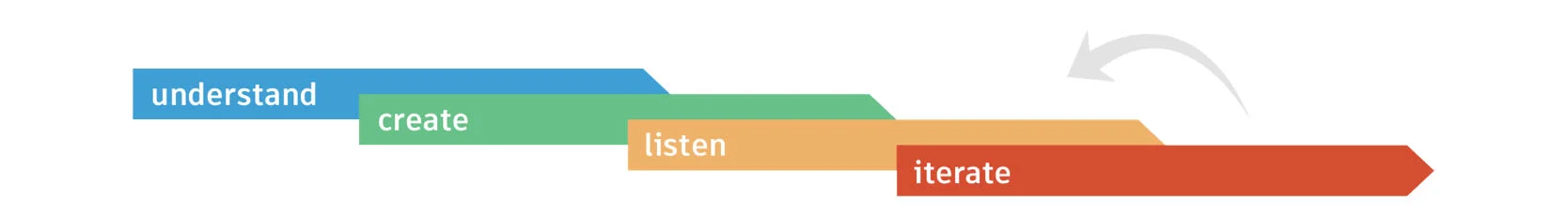
To get started, I first needed to understand and familiarize myself with BIM 360 Docs. In order to do this, I asked to be added to an existing Docs project through which I could see how a real team used the software. I also set up meetings with the lead UX architect on the BIM 360 team to furthermore understand the use cases of it.
After ideating with my team, I made an InVision prototype, shown below. The system detects a clash, and shows the user a list of solutions. The user can self-input factors like deadline and budget to sort these further, with time and money icons indicating the level of each.
With the help of UX researchers on my team, I was able to put this prototype in front of 4 BIM 360 users to get some initial feedback. The feedback I got was not what I expected - the design seemed too simple for users to put any trust into it, and most of the insight I got wasn't positive - here are a few quotes.

"It would be nice if clash detection was within the model - if you choose an option and see the thumbnail changing and the actual model changes as well."
"I'm not really sure what needs to go in the message box. How will I know that I can provide all the information to fix the clash?"


"We usually get hundreds of clashes per file... not all of them need to be addressed. There should be a way that minor clashes are accounted for or else this will be a huge waste of time."
One glaring issue seemed to be that this design didn't scale well - there could be many clashes but my design only accounted for one. To solve this, I met with the lead UX architect on the BIM 360 team to get more insight into how clashes work. My next prototype sorted clashes into the ones that needed real attention (as opposed to something that could be fixed on the construction site) and enabled the user to resolve many clashes at a time. I also changed the message feature into something that prompted the user with what information was necessary, making it easier to ensure that the right message was being sent. I also added thumbnails since the lack of this visual aid seemed to make my initial prototype less convincing. I took out the money and time icons since the users did not understand them immediately. My final iteration looked a lot different:
I put my final prototype in front of 4 more users and this time, the response was very different. Whereas the users from the first prototype showed a lot of skepticism about a design that claimed to be able to resolve their clashes easily, the second round of users were much more open to the idea.

"I could easily see my team saving a lot of time with a tool like this."
"When can I get my hands on this? [...] We spend way too much time in meetings trying to resolve clashes that this could definitely help fix."

Conclusion
Overall, my time at Autodesk taught me how to empathize with and design for a niche group of users, which was challenging since I was designing for a problem I probably would never have to deal with myself. I learned how to really start from the very beginning to understand the issue that I was trying to solve. I also learned that nothing is more valuable than real user feedback - seeing a drastic change in sentiment towards my project between iterations was really rewarding, and gave me my first experience with how much of a difference good user testing can make.
Created in Sketch and InVision - Summer 2016