
equinix.com
During my time at Equinix, I designed and created prototypes of multiple web pages and tools as the only UX designer on the equinix.com redesign, and collaborated with a small team of content writers, visual designers, and stakeholders through regular design reviews. Below are a few selected pages I designed.
equinix.com
Company: Equinix
Role: UX Designer
April 2017 - Present
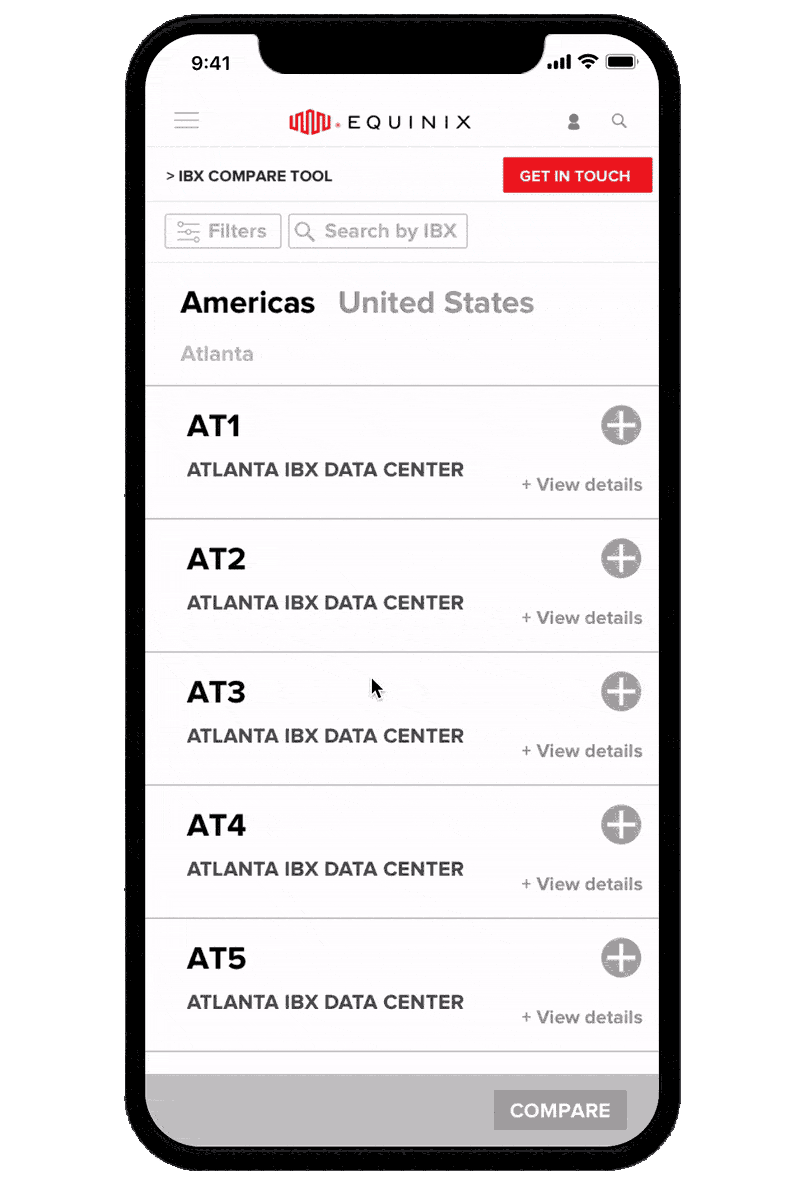
IBX (International Business Exchange) Comparison Tool
Equinix has over 200 data centers (IBXs) on 5 continents and 25 countries, and we needed a way for customers to efficiently search through and compare them. A functional tool was built without UX consideration, so I created wireframes for a more effective tool. Since data from customer interviews showed that an overwhelming majority of users preferred to access the tool from their desktop or laptop, we chose to focus on a desktop-first experience.

Search + Filters:
I decided to keep the filters on the left to stay consistent with other search tools on the Equinix site, and to ensure all filters were visible and not hidden beneath an unnecessary layer. I added a general Search by IBX field so users who had data centers or locations in mind already could easily add them. I also needed to account for the over 20 certifications that an IBX could have - to solve this, I added a search certification field but pulled out the most common certifications, sorted by most popular. I also bucketed the list of over 40 products we had into general Colocation, Interconnection, and Services categories and added a search products field so facilitate easy browsing. Lastly, the previous design didn’t have a visible record anywhere of which data centers were added. To remedy this, I added a static bar where you could see and delete them.

Cards:
My first card iteration was based on the existing tool’s cards, but I soon realized there was a better way to sort information. Our customer interviews showed that details like the address of the data center and the center’s area were unnecessary unless the user had already narrowed their choices down, so I chose to show them only under the additional information that could be expanded and collapsed. This enabled the user to see more search results at once without scrolling. I only kept the essential information visible on the collapsed card, like the name, code, and location of the data center.

Results:
Once the compare button was clicked, the tool redirected to a new, spreadsheet like page. I added a functionality to allow users to hide, display, and reorder data centers to more easily compare them. One issue we had was deciding when to cap the number of data centers a user could select. Although the spreadsheet functionality with horizontal scroll allowed that number to be basically infinite, we chose to cap it at 5 to allow for the ability to display and hide data centers - we also found that most users wouldn’t compare more than that since there weren’t any locations that had more in close proximity.

Final mockups below created by our visual designer, Nikki Radov


Insights: Analyst Reports
Created in Sketch & InVision, 2018-2019